Pública - Casa Abandonada
O Pública, banda de Porto Alegre, lançou este ano seu segundo álbum intitulado "Como num filme sem um fim". Desse disco temos "Casa Abandonada", com um dos melhores clipes brasileiros já vistos. A produção da Baxada Nacional Filmes é tão impecável que supera, de longe, a maioria das produções em longa-metragem do país. Também vale a pena conferir o resto da videografia impecável dos gaúchos.
Marcadores: videoclipe
David Storey e a Identidade Visual Two Tone
Essa eu peguei via beakaSka, que aliás é "o" blog pra quem curte o som e mora em Belo Horizonte como nós aqui. Uma pequena introdução e uma entrevista com o homem. Copiado e colado.
Em 1979, recém formado em belas artes, David Storey ingressou na equipe que, sob a direção criativa de Jerry Dammers (The Specials), criou a identidade gráfica da banda e do selo Two Tone. Quando o ‘look’ já tinha se estabelecido – terninho, gravata fina, chapéu “Pork Pie”, sapatos “Penny Loafers” e óculos “Rayban Wayfarers” – Storey e seu comparsa John ‘Teflon’ Sims, ajudaram na criação da linguagem gráfica que acompanharia o estilo. Agora devoto à pintura, David Storey fala de seu trabalho:
(Tradução livre. O texto original e a entrevista segue na integra em inglês).

In 1979, fresh from art college, David Storey joined the team that, under the creative direction of The Specials’ Jerry Dammers, created the graphic identity for the band and their label, Two Tone. While the fashion ‘look’ for Two Tone was already well established – shiny suits, thin ties, pork pie hats and penny loafers all topped-off with a pair of Rayban Wayfarers – Storey and his partner John ‘Teflon’ Sims, helped create the visuals to go with it. Now devoting his time to painting, David Storey talked to CR about his work.
CR: How did you first get into designing for the music industry?
While still at art college I was commissioned by Rocket Records to produce artwork for two Elton John tracks: ‘Someone Saved My Life Tonight’ and ‘Island Girl’, this work proved to be a stepping stone to a full-time job at Chrysalis Records once I’d graduated.
CR: The Two Tone work was done with John Sims – how did that partnership work?
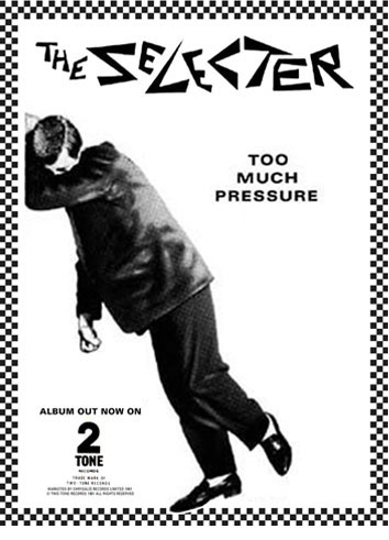
John ‘Teflon’ Sims and I met at Chrysalis and subsequently worked together as a team for over ten years! We were responsible for a huge amount of Two Tone graphics. As well as the sleeves, we produced hundreds of promotional items: posters, adverts, T-shirts, badges etc. John is a superb ‘Swiss School’ typographer while my strength tended to be on the pictorial/collage side, so we made a good team. After working in the music industry together we spent several years designing graphics for the Danish fashion company Inwear/Matinique.
CR: Two Tone had a very specific look in terms of the fashions worn by the musicians – how was that translated into a visual language for the sleeves and posters?
When the Two Tone label was launched, with the release of ‘Gangsters’ by The Specials, the fashion ‘look’ was already well established. It originated in Jamaica and was known as the Rude Boy look: shiny zoot suits, thin ties, pork pie hats, penny loafers… topped-off with a pair of Rayban Wayfarers… the most obvious reference to this in the label’s identity is the Two Tone man, known as Walt Jabsco.
CR: How involved was Jerry Dammers? What influence did he have?
Jerry Dammers, the Specials keyboard player, was the brains and creative driving force behind the Two Tone label. He had an obsessive approach to the visuals and worked very closely with John and I on everything right down to the most minute detailing. The entire visual approach came from Jerry, he wanted everything to have a fresh, simple, direct, home-spun, feel. He was great to work with but extremely demanding.
CR: Can you explain who (or rather what) Walt Jabsco was and how he came into being?
As I remember it Jerry had an old vintage bowling shirt which had the name Walt Jabsco embroidered on the front and this name just seemed to get transfered to the Two Tone man. The drawing of the man was based on a photo Jerry had of Peter Tosh.

CR: Why the checkerboard graphic?
As well as being literally made up of two tones the checkerboard pattern was meant to symbolise racial harmony, which is a brilliant idea as Two Tone was a fusion of black and white youth culture. It was first used in 1979 on the paper bag that ‘Gangsters’ was sold in.
CR: You have described your Two Tone work as having an anti-design aesthetic – can you explain what you mean?
Our whole approach was what you might call ‘none design’ meaning that Jerry would root out any attempts by John and I to introduce gratuitous design embellishments. This ruthless weeding process resulted in bold, simple, direct graphics and is probably the main reason that the Two Tone style has such an enduring impact.
CR: What do you feel about the Two Tone work now looking back on it?
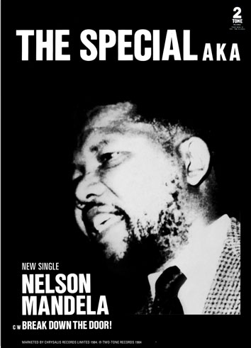
I am very proud of it. Partly because of its timeless appeal, partly because of it was integral to the success of the Two Tone label – but mainly because it packaged and promoted a unique style of music… dance music that conveyed important social and political messages to a huge audience. Probably the best examples of this are ‘Ghost Town’ and ‘Nelson Mandela’, both by The Specials.
CR: Does graphic design play such a central role in music and youth culture today? If not why not?
Personally I think graphic art is alive and well in today’s youth culture… it’s different, diverse and it’s everywhere of course. I see remarkable things happening in the gaming industry and animation in particular. Most people download their music now so you don’t see many record sleeves around. Although I did see one the other day that made me smile… my 11 year old daughter showed me a Lily Allen release, ‘Blank Expression’ , which is packaged in a perfect replica of the original Two Tone paper sleeve!
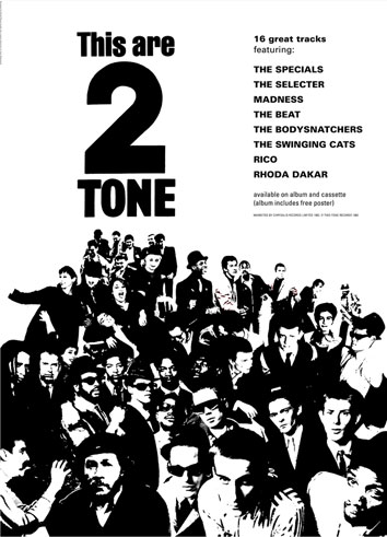
Storey and Sims have recently released a set of some of their finest Two Tone posters in limited editions of 100 Giclée prints, printed on fine art paper, available to buy from Storey’s website. CR readers can win a copy of the We Are 2 Tone print in a competition in our July issue, out June 25.
Also available from Stoorey’s site are prints of his work for The Housemartins
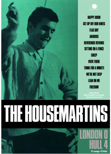
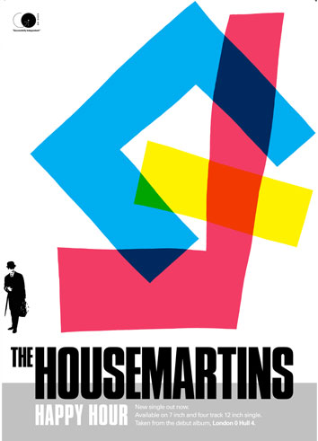
Via: http://www.creativereview.co.uk/cr-blog/2009/june/two-tone
OH MY GOD! POSTERS!
o OMG Posters é um site gringo que reúne diariamente a produção dos artistas gráficos que se dedicam ao Poster, principalmente àqueles mais tradicionais que imprimem séries limitadas através de serigrafia(silk-screen).
Nem toda a produção exibida no site é voltada para shows mas vale a pena dar uma olhada no que aparece por lá até mesmo pra entender um pouco como funciona o mercado desse tipo de trabalho. O Blog ainda dá umas canjas de toys, zines e posters de rua também.
'Cultura do pôster' chega ao Brasil animando designers e colecionadores
do G1:
Há tempos, cartazes de divulgação de shows não são mais pedaços de papel com data de validade definida. Já existe uma cultura de colecionadores e admiradores para quem um pôster com informações de um show pode ser tão valioso quanto a apresentação em si.
“A ideia do site surgiu para que o trabalho de quem cria os pôsteres não termine no dia do show, não fique pelo caminho”, explica Seola, que começou desenhando cartazes para a sua banda, Z, em Florianópolis. Com visual simples e "clean", o Posterize funciona como uma exposição aberta e permanente da produção nacional na área. “É uma forma de indexar, perpetuar estes trabalhos e, claro, divulgar bandas e designers”, resume.
Mesmo que no Brasil a “cultura do pôster” não seja tão forte quanto em outros lugares como os EUA, já há também aqui um site que se dedica a armazenar e mostrar os cartazes de shows que realizados no país. Trata-se do Posterize, criado em março deste ano pelo designer Ricardo Seola.
Para ler na íntegra a reportagem clique aqui.
Forum do Computer Arts apresenta as melhores capas segundo os usuários.
O pessoal do site inglês computer arts soltou no forum de discussão do site uma enquete no esquema "fun friday" em que todos os usuários podem enviar capas de discos bacanas. Veja aqui o que o pessoal anda postando por lá. Tem muita coisa bacana de verdade, alguns velhos conhecidos e algumas coisas inusitadas também.
As 24 melhores marcas de bandas
o Spinner.com fez antes o que eu prometi fazer um tempo atrás e listou as 25 melhores marcas de bandas.
A lista:
25. Ramones / 24. Nine Inch Nails / 23. Public Enemy / 22. Korn / 21. Aerosmith / 20. Black Flag / 19. Phish / 18. H.I.M. / 17. Beatles / 16. Bauhaus / 15. The Cramps / 14. Metallica / 13. Abba / 12. Wu-Tang Clan / 11. Queen / 10. Van Halen / 09. Misfits / 08. Grateful Dead / 07. Scissor Sisters / 06.AC/DC / 05.The Who / 04.Kiss / 03.Yes / 02.Rolling Stones / 01.Prince
Não concordo muito com a ordem, mas acho que a lista tem boas lembranças como o Public Enemy e o H.I.M. Na minha opinião esqueceram do Iron Maiden. Aliás, pra colocarem Phish(??) eles devem ter esquecido uma porrada de logo boa. Algumas dessas eu devo postar novamente com um pouco mais de informação que o Spinner trouxe.


